An introduction to template building with Facelets, CSS, HTML and JSF 2.2
Facelets is a great technology for creating templates for websites and then adding dynamic functionality. In this tutorial, we will introduce the idea of creating a template page with CSS, HTML, JavaScript and JavaServer Faces 2.2 (JSF).
Designing websites shouldn’t fall into the hands of Java developers. Java developers are notoriously bad at visual design, and all you have to do is look at some of the popular Java development sites to verify that assertion. But having said that, any software developer who makes a living on the presentation tier has to get their hands dirty with some hypertext when the artistic vision of the web designers comes head to head with software development.
Facelets as the template engine
The key to managing a modern enterprise website is templating. There are a number of great templating technologies out there, be it Freemarker or Velocity or Mustache, but if you’re using JavaServer Faces (JSF) and are committed to a Java EE based approach to visual design, your template engine of choice is going to be Facelets.
If you’re using JavaServer Faces (JSF) and are committed to a Java EE based approach to visual design, your template engine of choice is going to be Facelets.
Now the first step in working with any templating engine is to actually put a template together. Essentially, you want to put together a basic HTML page that properly lays out your various page components, be it the header, the footer, a navigation pane and a core content window.
Page templates with HTML and CSS
There are two basic approaches to creating a basic template, one of which is bad, and one of which is good. The bad way? To use HTML tables, laying out headers and footers and all of the other various elements using rowspan and colspan elements. Don’t be offended if that was your go-to mechanism of the past. There are plenty of tools and technologies on the market that still use HTML tables for laying out content. In fact, if you’re still doing work with WebSphere Portal 6.1, you’re essentially forced to. But if you’ve been doing modern web development, and when I say modern, I mean circa 2002, you should be using stylesheets and DIV elements instead.
By the way, we said that there were two ways: tables and stylesheets. It might be worth adding that there is an option that lies somewhere between two and three, which is HTML5 with CSS3. HTML5 adds a variety of new template based tags, such as footer and header, but that is outside of the scope of this particular tutorial. They're easy to use though, so if you are using the HTML5 standard, check them out after going through this tutorial.
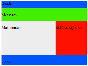
Here's a simple page layout, with all of the key elements included.

As you can see from the code below, the HTML is little more than a bunch of DIV tags with id attributes describing the area, be it sidebar, footer or messages-container.
The code behind the curtain
<html xmlns="https://www.w3.org/1999/xhtml">
<head>
<link href="stylesheet.css" rel="stylesheet" type="text/css"/>
</head>
<body>
	<div id="page">
		<div id="header-container">
			<div id="header">
				<p>Header</p>
			</div>
		</div>
		<div id="messages-container">
			<div id="messages">
				<p>Messages</p>
			</div>
		</div>
		<div id="content-container">
			<div id="content">
			<div id="signon">
				<p>Main content</p>
			</div>
			</div>
			<div id="sidebar">
				<p>Sidebar/Right-nav</p>
			</div>
		</div>
		<div id="footer-container">
			<div id="footer">
				<p>Footer</p>
			</div>
		</div>
	</div>
</body>
</html>
With the HTML page coded, the manner in which the various elements get arranged on the page is determined by the accompanying stylesheet.
#page {height:680px; width:1000px; margin:0 auto}

#header-container {height:100px; background: #0055FA}

#header{background: #0055FA; width:1000px; height: 100%; margin:0}

#messages-container {height:50px; margin:0; display: inline-block;}

#messages {background: #44EE00; width:1000px; height: 100%; margin:0; display: inline-block;}

#content-container {height:100%; margin:0}

#content {float:left; background: #EDEDED; width:700px;  height:100%; margin:0}

#sidebar {float:left; background: #FF1100; width:300px;  height:100%; margin:0}

#footer-container {height:100px; margin:0; clear:both; display: inline-block;}

#footer {background: #0055FA; width:1000px; height:100%; margin:0 auto; display: inline-block;}
The magic behind CSS based layouts
Key attributes used for laying out the page include height, width, and the float attribute which determines how different DIV elements interact with each other. Notice that the content DIV and the sidebar DIV use a float:left setting. This allows them to sit side by side, so long as they fit within the confines of the containing DIV tag. The clear:both setting in the footer-container ensures that the footer is not placed in line with any other DIV that may have a float attribute assigned to it.
And that is how a software developer initially attacks the job of developing a dynamic template for their website. But of course, the code we currently have is static. The next step is to introduce a templating technology. Since we're interested in JSF and Java EE, Facelets will be the technology we'll be using to add some life to this application.
You can follow Cameron McKenzie: @cameronmcnz
Interested in more articles and opinion pieces from Cameron McKenzie? Check these out:
- Why the Amazon S3 outage was a Fukushima moment for cloud computing
- Software ethics and why ‘Uber developer’ stains a professional resume
- It was more than user input error that caused the Amazon S3 outage
- Don’t let fear-mongering drive your adoption of Docker and microservices?
- Stop adding web UI frameworks like JSR-371 to the Java EE spec


