The 5-second rule to create effective technical illustrations
In addition to my work as a technical writer and technology journalist, for the last nine years I also publish a cartoon that takes jabs at technology and the technology business. During that time, I’ve learned an important lesson that I call the 5-second rule: When a reader views one of my cartoons, I have five seconds to get the meaning across and get a laugh.
Figure 1 below shows a cartoon that demonstrates this rule:
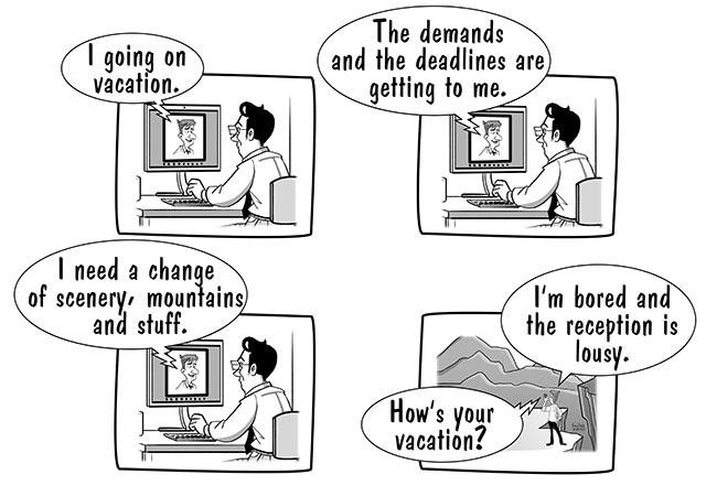
Figure 1: The 5-second rule dictates that a graphic must communicate its meaning in under five seconds.
The 5-second rule forces me to focus on details such as the cartoon’s intent, how many words I use in a caption, the position of characters and frames and the overall construction of the cartoon, among other things.
Moreover, one can apply this rule to technical illustrations. Few technical illustrations are intended to make people laugh, but they must communicate their intended meaning quickly and accurately. This means one must not only present information in a way that is visually apparent, but also in a way that a reader processes information consciously and subconsciously. As a result, a technical illustrator must take a more nuanced approach to constructing graphics.
This article demonstrates the role of such nuance when creating a technical illustration. We will create a technical illustration that describes a technical process and then evolve that illustration over a few versions, each taking a more nuanced approach to make the graphic’s content more digestible.
The technical process described by the illustration, a typical one among most development teams, is as follows:
- Create a feature branch in GitHub and then check out that branch on a developer’s machine to do some work.
- The developer commits the changes to the work product and creates a GitHub pull request against those changes.
- The pull request is approved, and the branch is merged into the main branch.
Applying the 5-second rule to technical illustration
Figure 2 is a first attempt to graphically depict the process described above. Keep in mind where your eye is drawn to in this illustration.
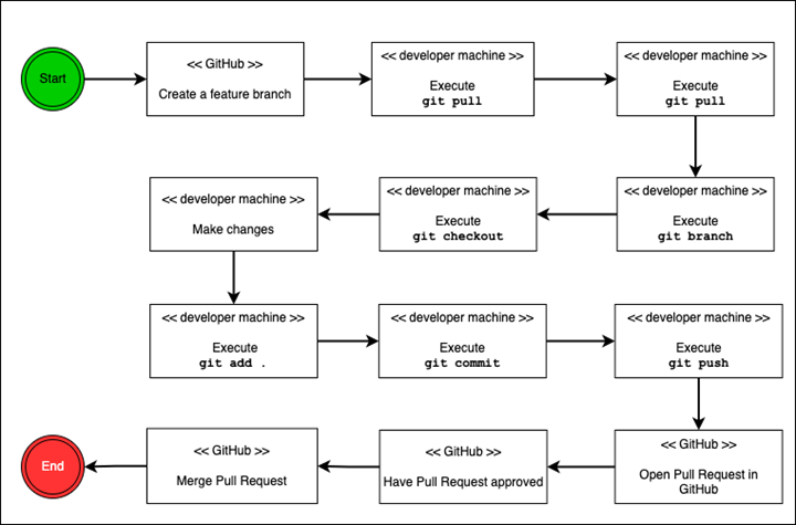
Figure 2: Illustrating a feature branch process in GitHub.
I’ll wager that your eye was drawn to the green “Start” circle and the red “End” circle. This makes sense because those colors stand out versus the black and white scheme of the overall illustration.
The use of green and red is not arbitrary. They have intrinsic meaning, associated with the colors in a traffic light: green means “go” while red means “stop.” Thus, the reader’s mind probably assumes that the green Start circle indicates the beginning of something and the red End circle indicates the end of something. Additionally, the arrow emitting from the Start circle pointing to the right tells your mind to track your eyes in that direction to the next box.
One might also assume the reader understands that the box and the text within it describe a task in the process. The caption beneath the graphic not only reinforces the notion that the graphic represents a process, it is critical to this understanding.
The caption defines the context of the graphic. To derive clearer meaning from the graphic, readers inspect each box more closely. Even a simple determination of how many steps are in the process requires the reader to count the number of boxes, which takes time — and potentially violates the 5-second rule to provide the most meaning out of the graphic in under five seconds.
Figure 3 below is the next iteration of the technical illustration. Notice the addition of blue circles that assign a number to each task.
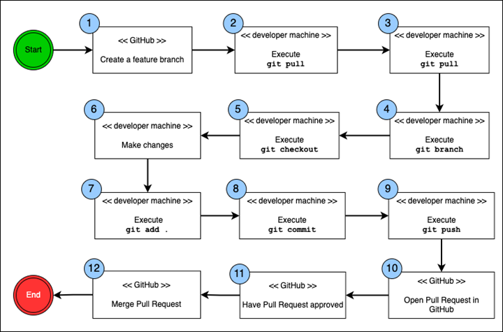
Figure 3: Illustrating a feature branch process in GitHub.
Adding the numbered circles in blue extends the green/red coloring motif introduced earlier, and draws the reader’s eye to the task boxes in a way that reinforces the sequence of the tasks. The numbered circles also communicate implicitly how many tasks are in the process. The reader does not need to count them, only to read the number in the final blue circle before the End circle to determine the number of tasks.
Overall, the reader’s eye more quickly traverses the graphic and conveys more meaning. However, there is a problem, albeit an unconscious one.
The natural eye movement of an English language reader is from left to right. Yet in Figure 3 the flow of the process forces the reader’s eye movement to alternate reading directions with each line: from left to right, then from right to left, then right to left again and left to right again. Alternating reading directions forces English-language readers to subconsciously adjust their natural inclination to read from left to right.
Compounding this problem is that the red End circle appears on the left side of the graphic. This further undermines the left-to-right reading pattern.
Figure 4 below is a revised version of Figure 3. Notice that the task boxes on all the lines read from left to right, and the red End circle appears on the right side of the graphic. Both of these changes address the reader’s propensity for a left-to-right reading pattern.
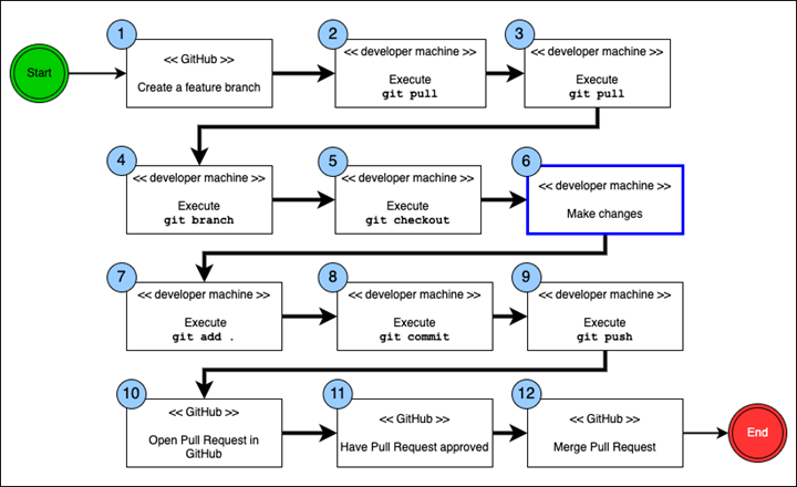
Figure 4: Illustrating a feature branch process in GitHub.
However, we have introduced a new problem: a potential cognitive disorientation, concerning the eye’s preference for proximity compared to reading direction.
Figure 5 below shows a side-by-side comparison of the two most recent versions of the illustration: Figure 3 on the left with the alternating reading pattern and Figure 4 on the right with the consistent left-to-right reading pattern. This is where the issue of disorientation comes into play.
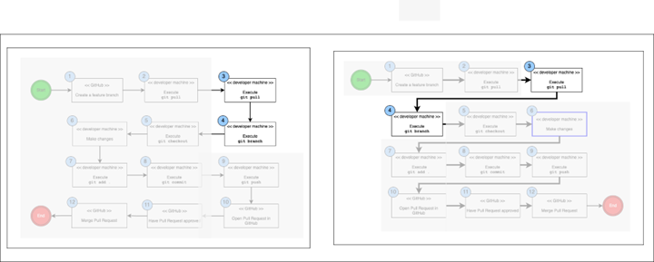
Figure 5: The issue of proximity compared to reading direction.
In the left side of that graphic, the eye is already on Task 3 and Task 4 is directly underneath it. This encourages the reader’s gaze to move from right to left. In fact, moving the reader’s eye all the way to the left to get from Task 3 to Task 4, as shown in the right-side graphic, might be more difficult.
The trick is to teach the reader’s eye to move all the way to the left without incurring additional mental effort. To do this, we increased the thickness of the connector arrow between Task 3 and Task 4, which draws the eye to the connector arrow and “teaches” the reader’s eye to move to the next row of tasks and then read from left to right.
Confirm the 5-second rule with usability tests
How do we really know if increasing the thickness of the connection arrow really helps the reader absorb the flow of tasks in the diagram? The best way to answer this question is to conduct a usability test in which each diagram is presented to a group of readers.
How to conduct such a test is outside the scope of this article. However, the objective of the usability test is to determine which diagram is easier to understand in the shortest time possible. Hence, the usability test must measure the speed by which readers absorb the graphical information in a quantitative manner. Opinions about the preferred diagram will vary from reader to reader. A quantitative approach will produce results that are easier to analyze objectively.
Hopefully, the examples provided in this article will inspire you to take the time to apply the 5-second rule to create technical illustrations that make it easiest for readers to absorb graphical information quickly and accurately.


